Influential
Five platforms of scattered feedback, turned into one measurable team goal.
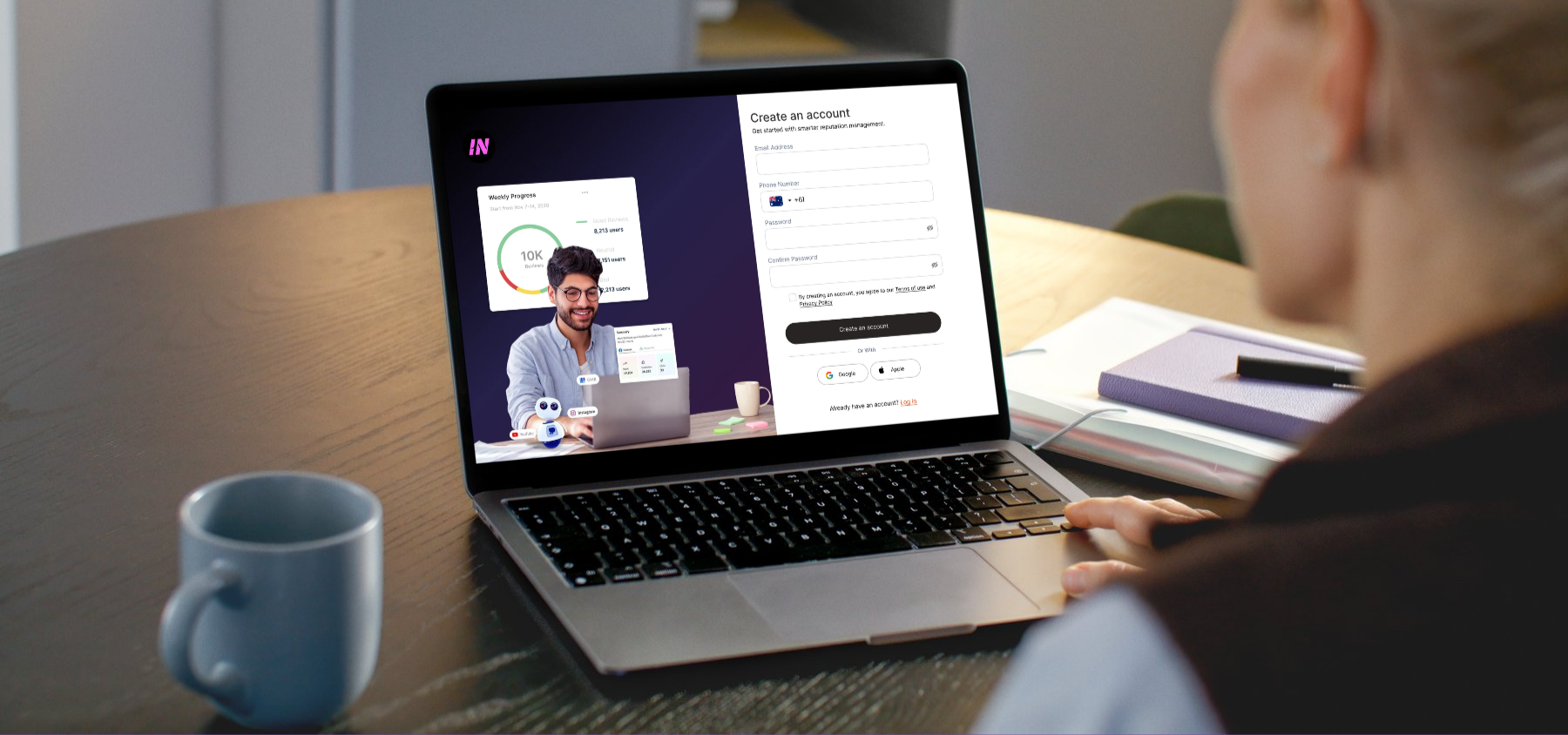
Onboarding: a preview of the value on offer, a weekly review breakdown, sits alongside account creation rather than behind it.
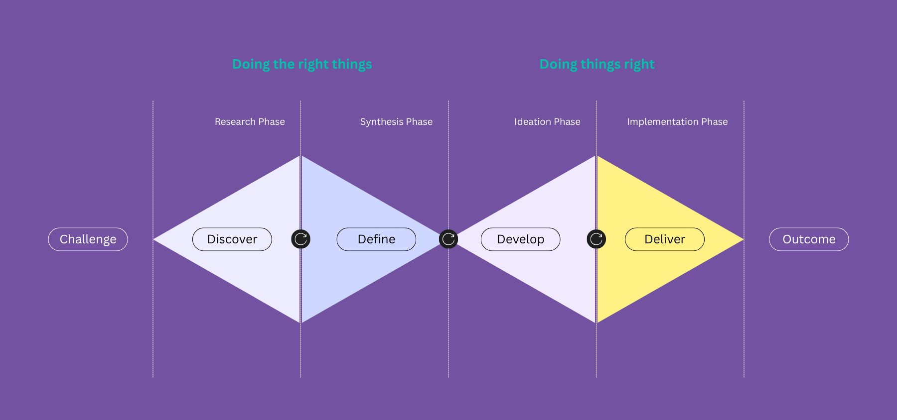
The Double Diamond design methodology driving the project's foundational structure.
Three groups within the target audience: multi-location owners (the primary buyer), single-location owners scaling up, and front-line team members who actually action the reviews.
Early conversations with business owners, exploring how they currently track feedback and what "winning" looks like to them.
A small group session reacting to the core concept, one dashboard for every platform, used to stress-test the idea before any screens were designed.
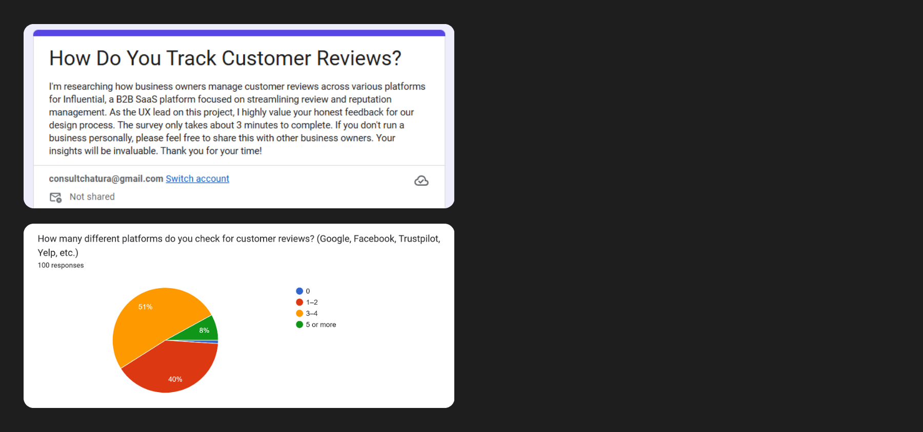
Survey data establishing that over 90% of respondents check multiple platforms for feedback.
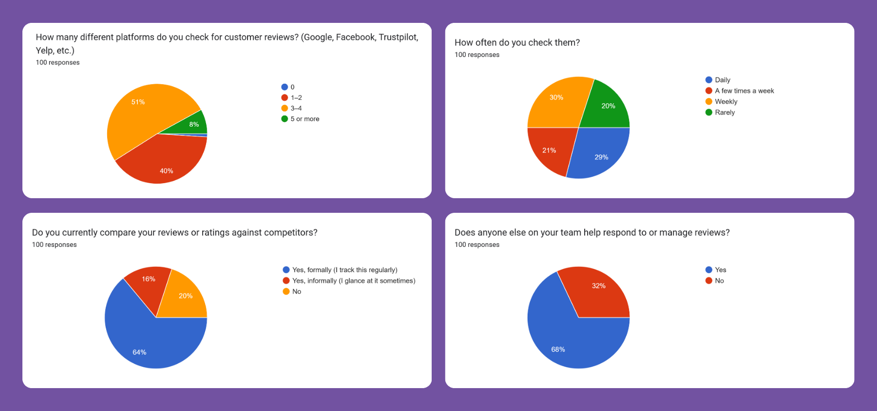
The remainder of the survey findings, quantifying how often owners check, and whether they formally benchmark against competitors.
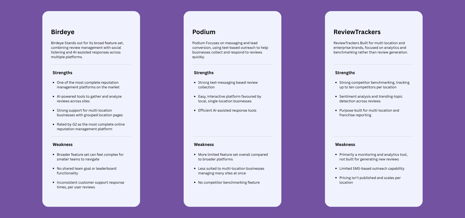
How three established players approach review management, and where the gap for Influential actually sits: none of the three turn benchmark data into a shared, team-wide goal.
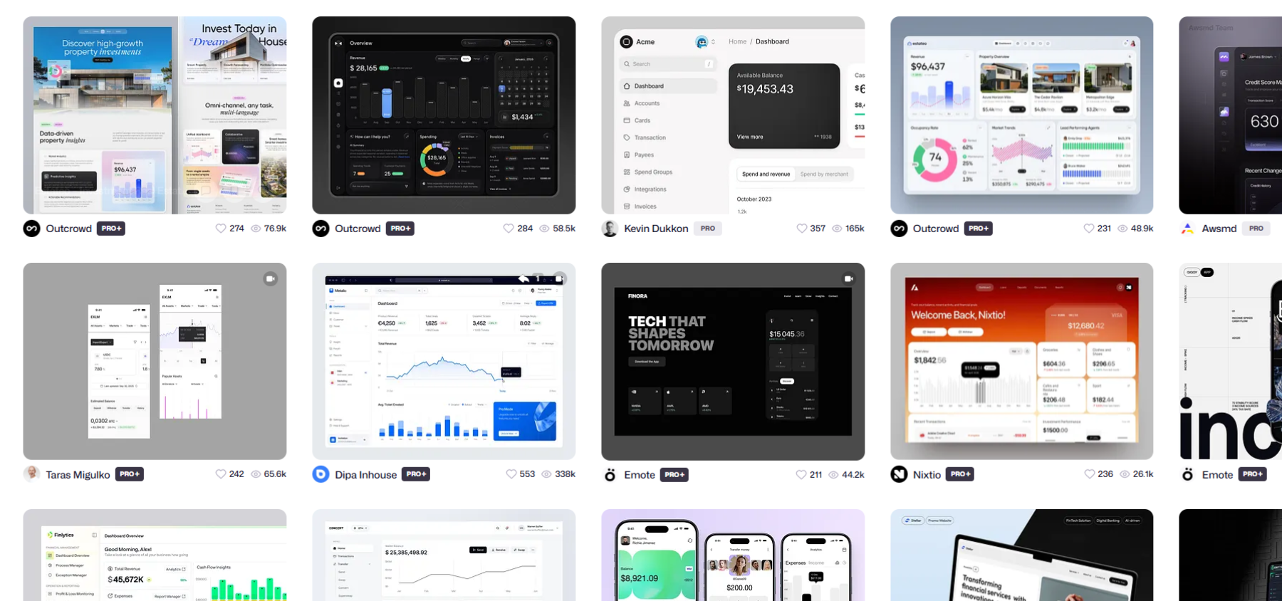
Visual research alongside the competitor analysis: a moodboard of dashboard patterns from across SaaS, used to inform layout and data-density decisions before any Influential screens were drawn.
Problem statement: Business owners managing multiple locations or brands have no single place to track how their business is actually performing. They must manually check review platforms one at a time, have no benchmark for how they compare to competitors, and no way to turn team effort into a shared, visible goal. Feedback goes unnoticed, performance isn't benchmarked, and teams lack a shared target to work toward.
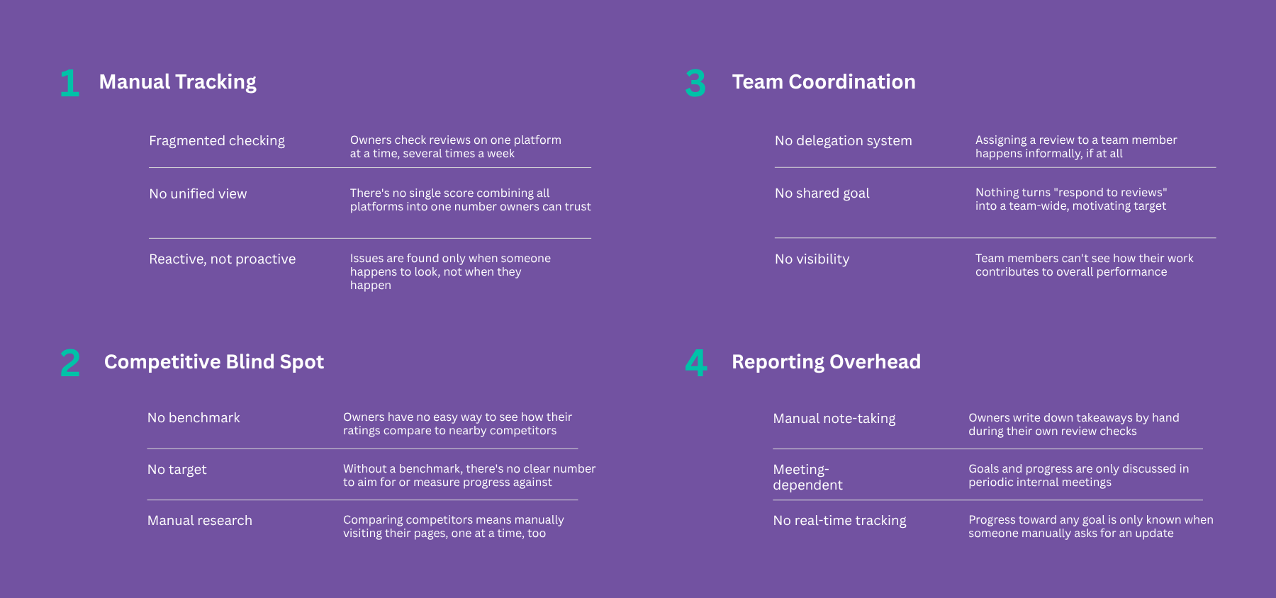
Sarah's current-state routine, broken into four friction points: fragmented manual tracking, no competitive benchmark, no way to coordinate the team, and a reporting process that runs entirely on memory and meetings. These four themes map directly onto Influential's core features.
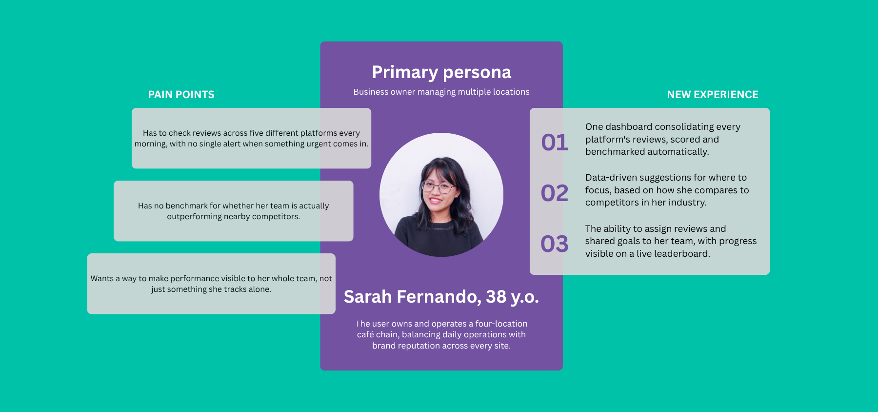
Sarah, 38, owns a four-location café chain. Needs oversight without babysitting every platform herself.
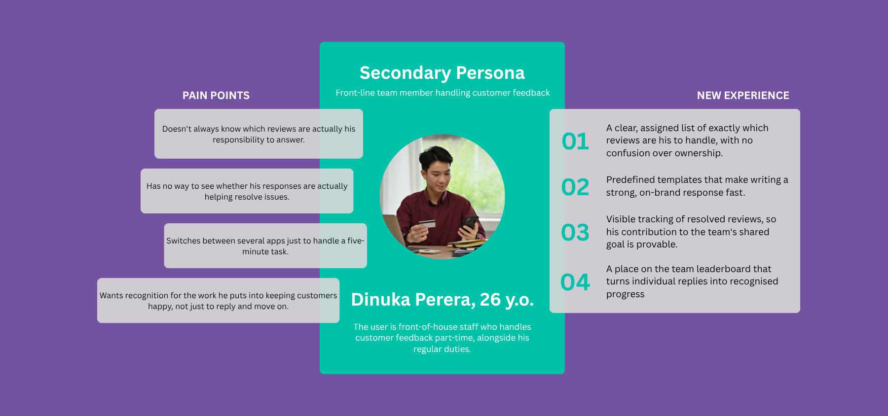
Dinuka, 26, handles front-of-house feedback part-time. Needs clarity on what's his to handle, and proof it matters.
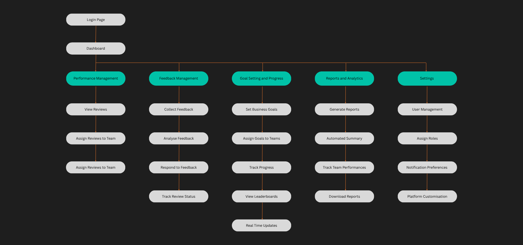
The first pass: one structure for every user, before research had separated who was actually using the product, and how.
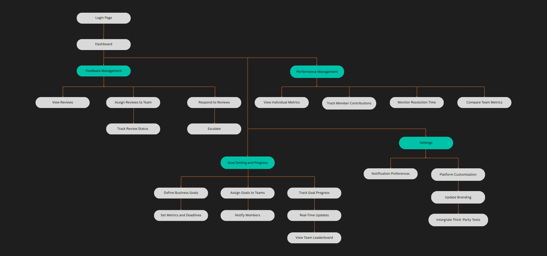
Once the owner's role was clear, the admin sitemap gained full oversight: assigning reviews, assigning roles, defining business goals, and configuring the platform.
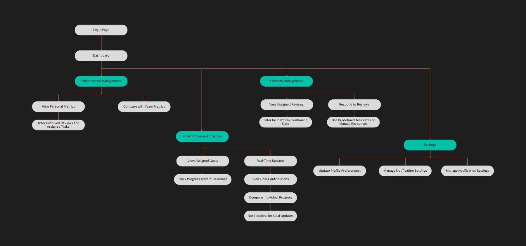
The team member's sitemap, scoped down to their own assigned reviews, their own goals, and their own metrics nothing they didn't need.
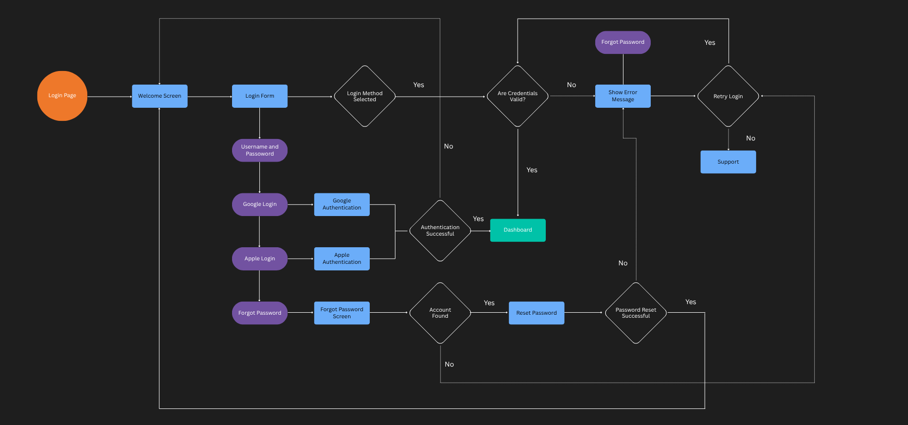
Every entry point mapped, including social login, forgot-password recovery, and retry/support fallback for failed logins.
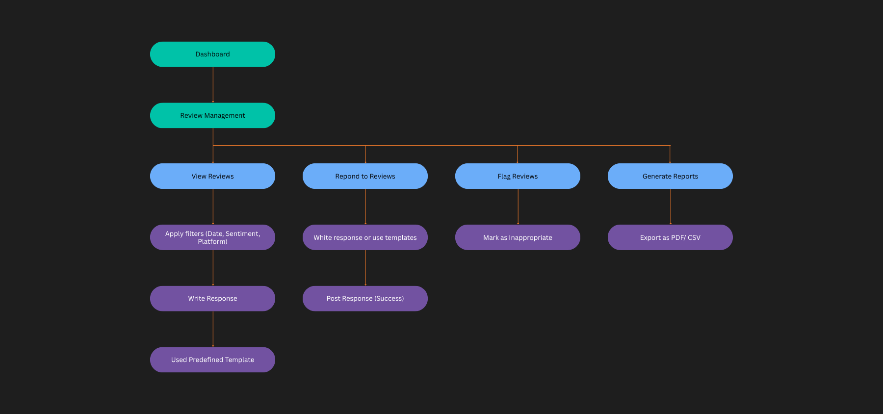
The core loop of the product: view, filter, respond to, flag, or report on a review, with templated responses to keep replies fast and consistent.
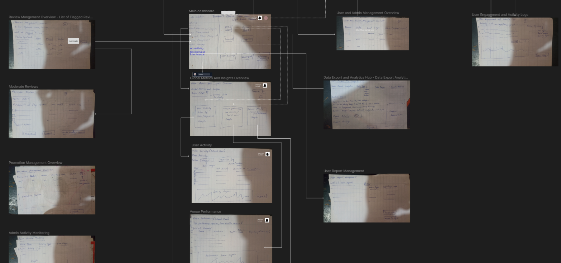
Parallel wireframing on the admin side: review moderation, activity monitoring, and analytics overview, mapped before the sitemap was finalised.
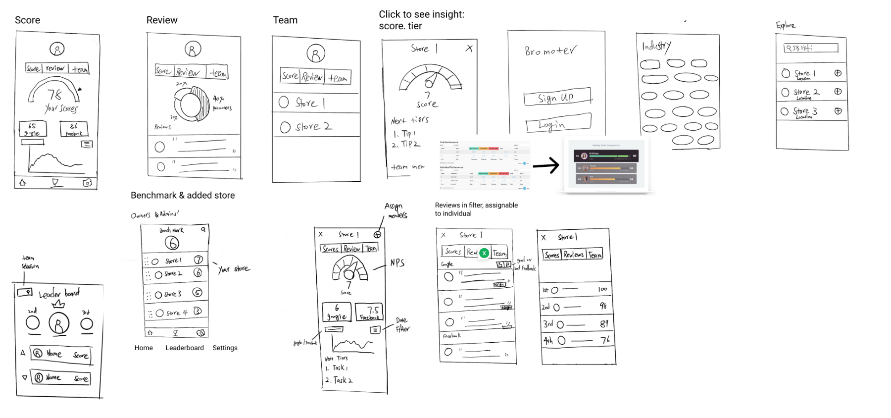
Early mobile wireframes: score, review, team, and leaderboard screens, laid out before any visual styling.
Five participants, three tasks on the low-fi wireframes: find and respond to a review, assign a review to a teammate, and locate the team leaderboard. Findings to be added once sessions are complete.
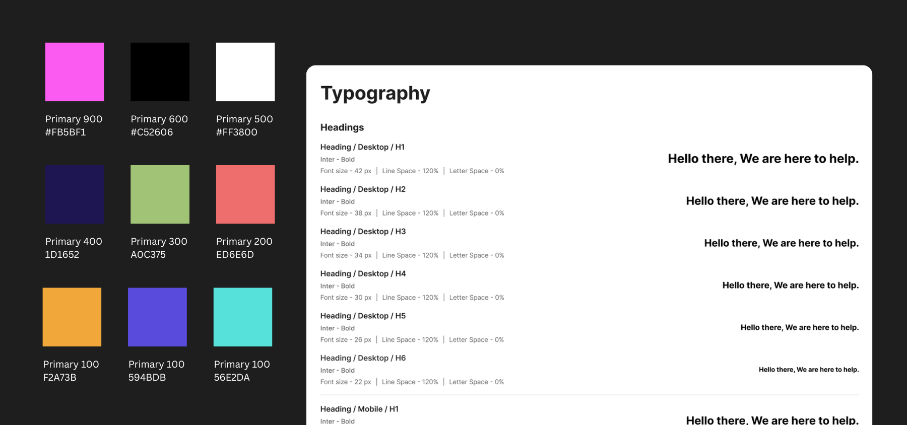
The visual language: a teal-and-neutral palette for clarity against dense data, and typography chosen to stay legible at dashboard density.
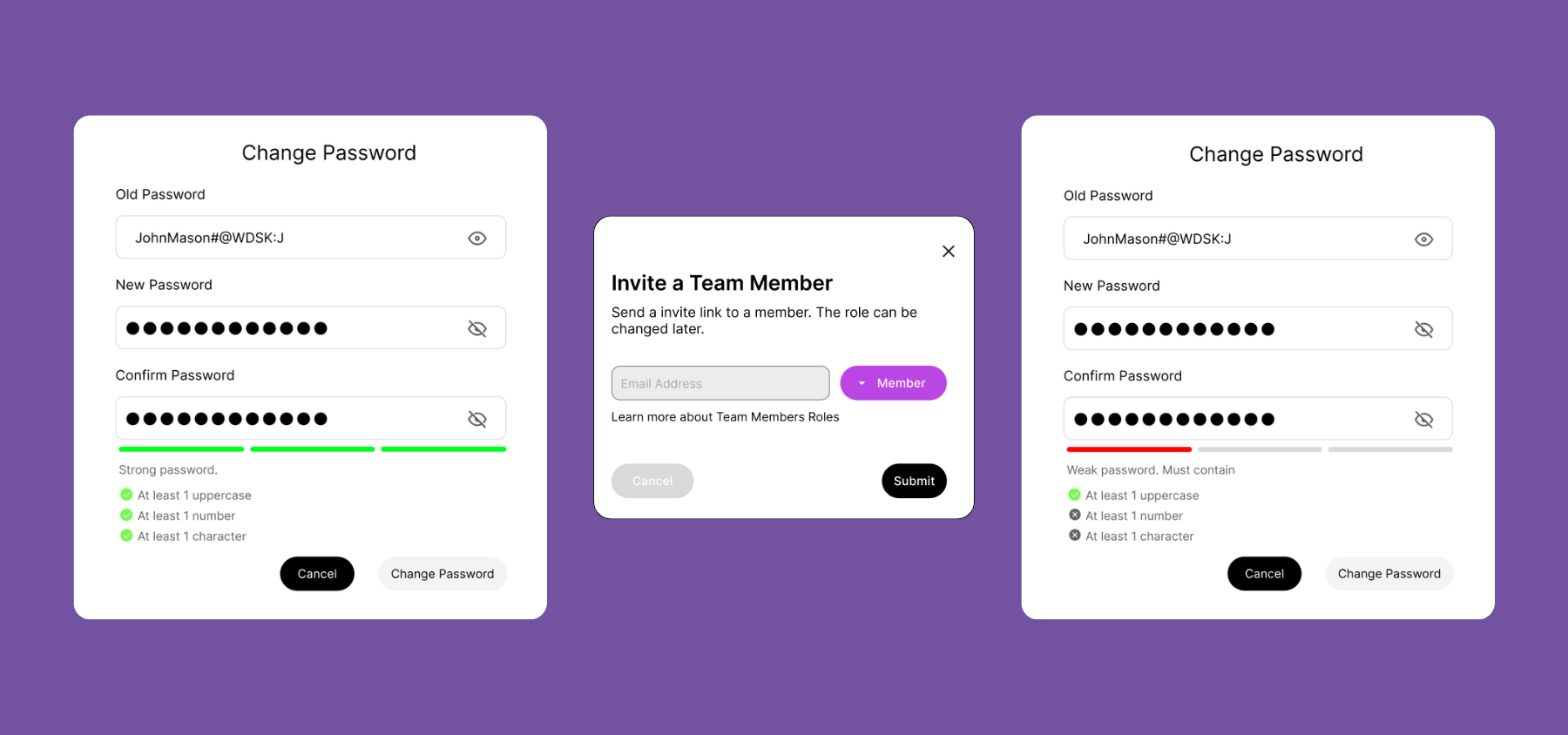
Component library extracts: clear input fields, active states, modals, and error-prevention guidelines embedded into the UI.
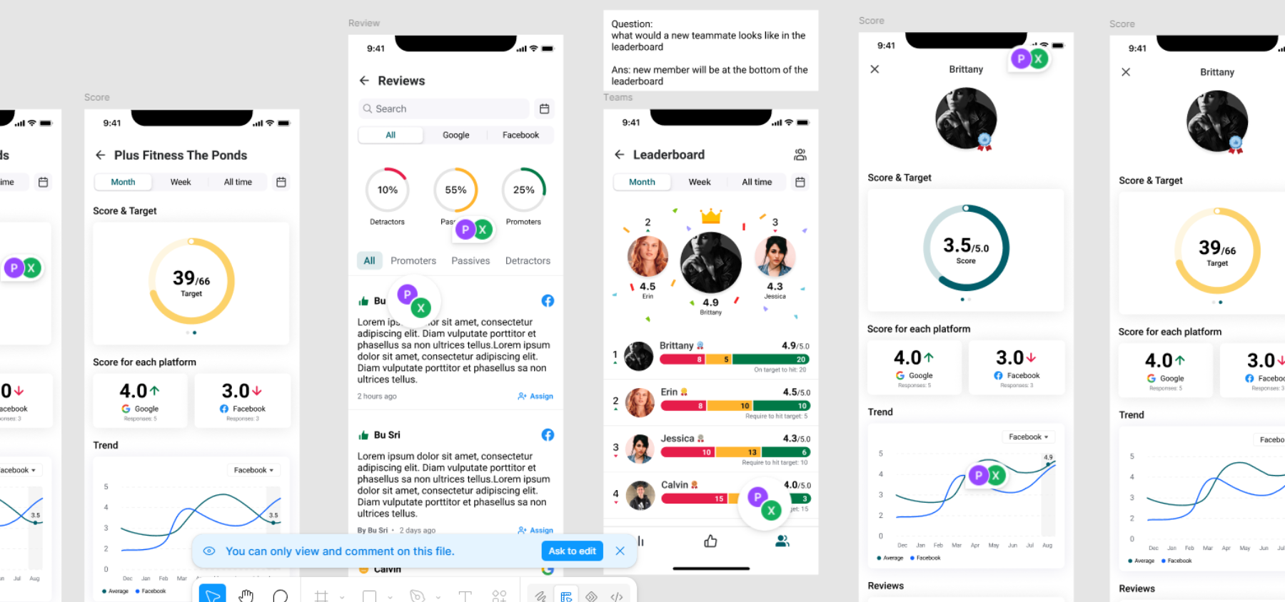
An earlier direction: a mobile-first app built around circular score gauges and a gamified leaderboard. It was superseded once research pointed toward a web dashboard as the primary surface, with mobile as a companion rather than the main experience.
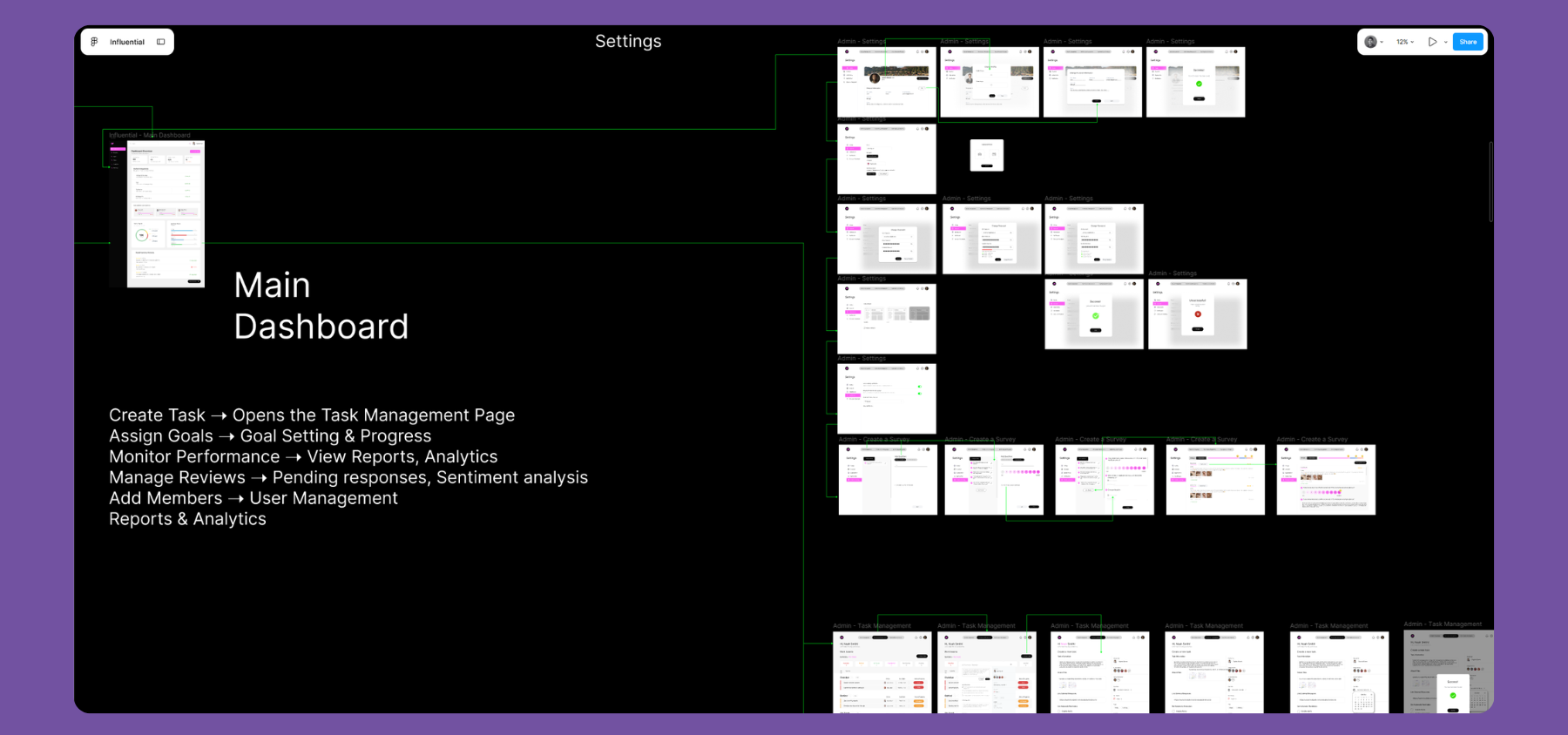
Transitioning to high-fidelity: laying out the admin architecture directly in Figma.
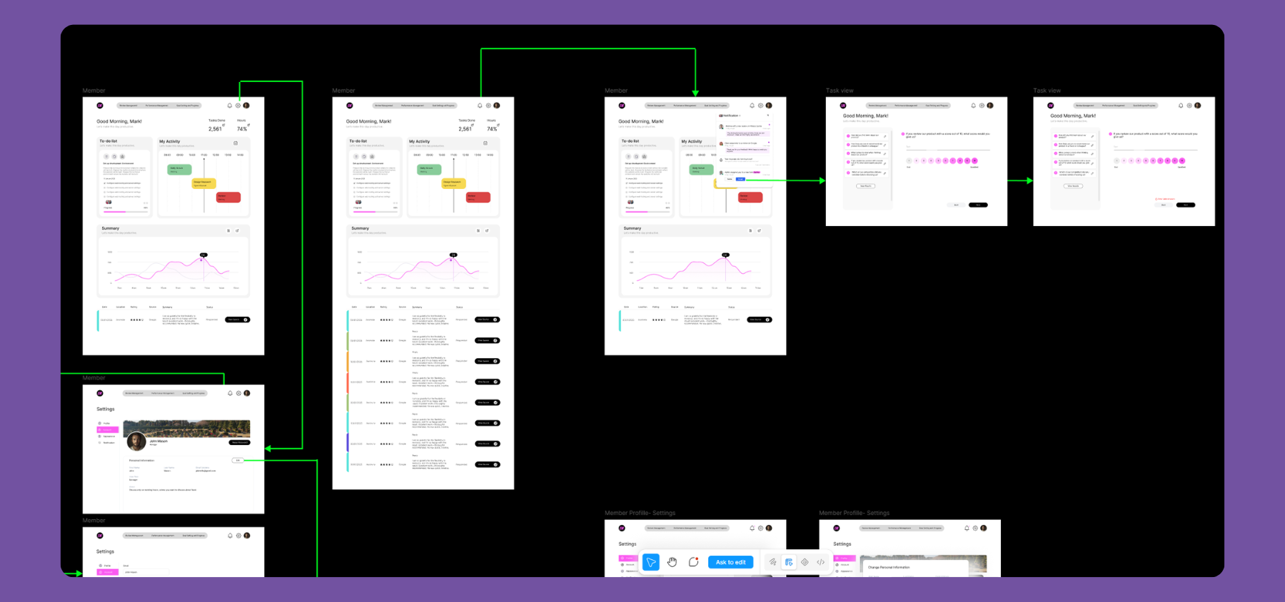
Mapping out complex micro-interactions, permissions, and member-specific interfaces on the canvas.
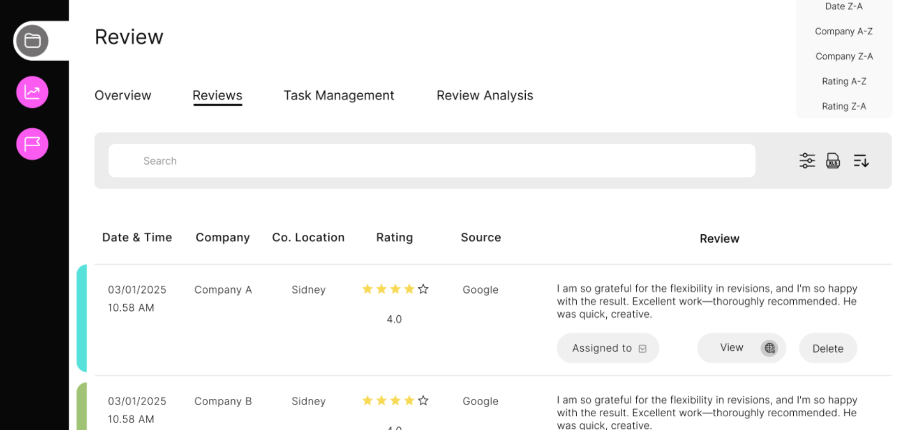
Reviews filtered by platform and sentiment, with assignment and status controls built directly into the table.
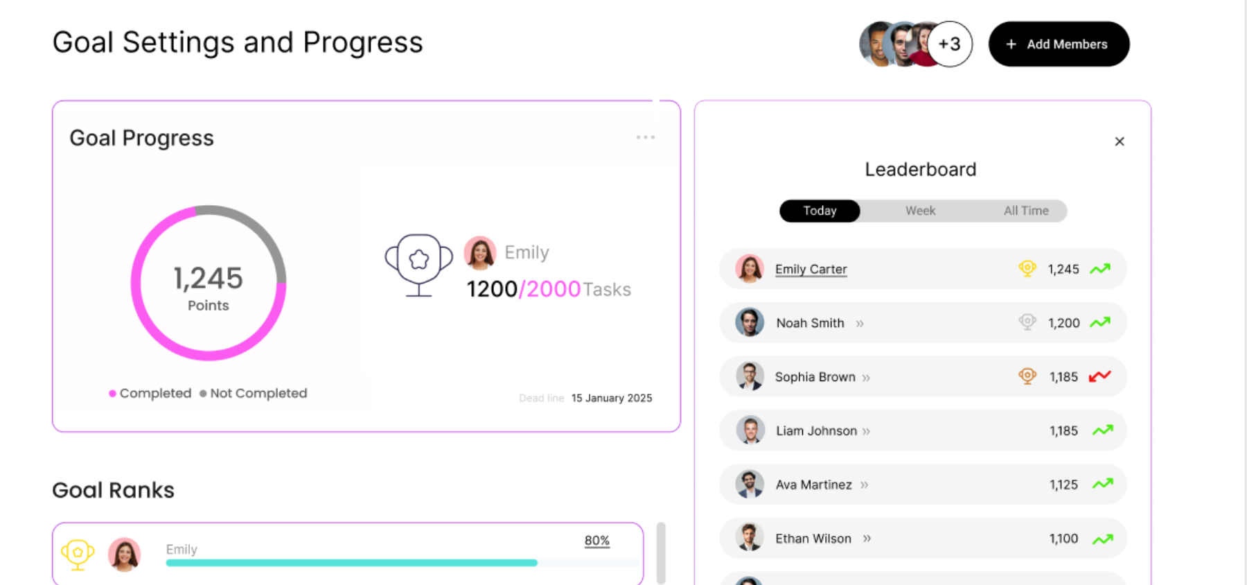
Shared goals made visible: a ranked leaderboard turning individual review responses into team-wide momentum.
The same tasks, re-tested on the high-fidelity build, to check whether changes made after round one actually resolved the friction found earlier. Findings to be added once sessions are complete.
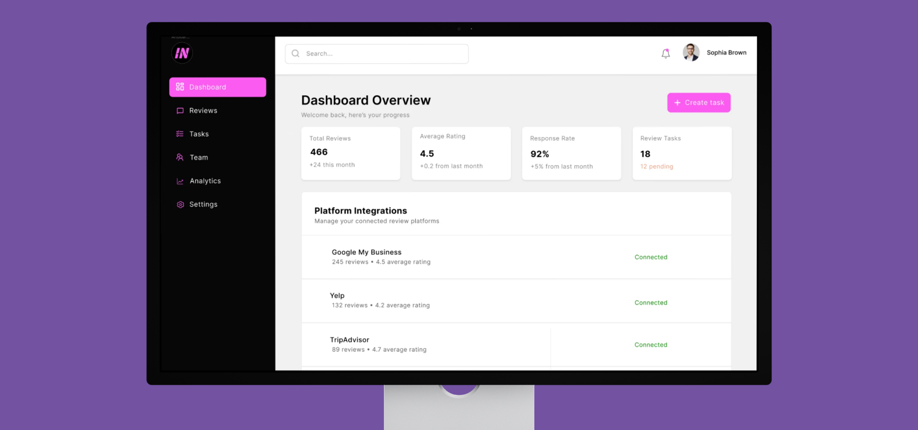
The finished product: one dashboard where a business owner sees every review, every platform, and every team member's progress in one place.
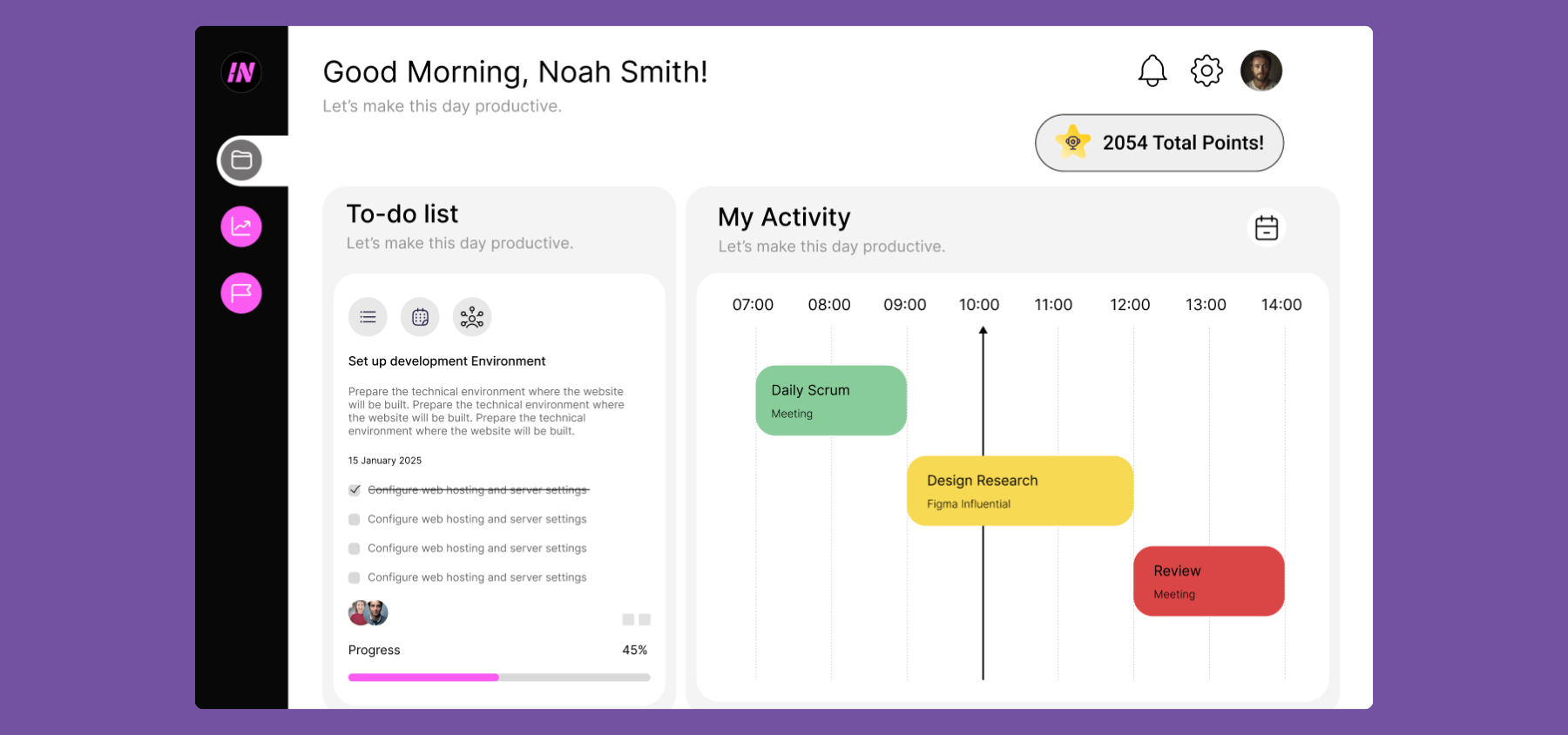
The Admin homescreen view prioritizing immediate team activities and to-do action points.
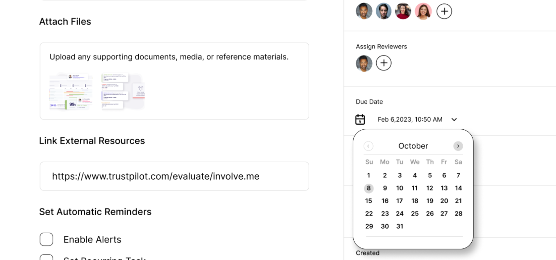
The full admin experience extending into granular task assignments and due dates.
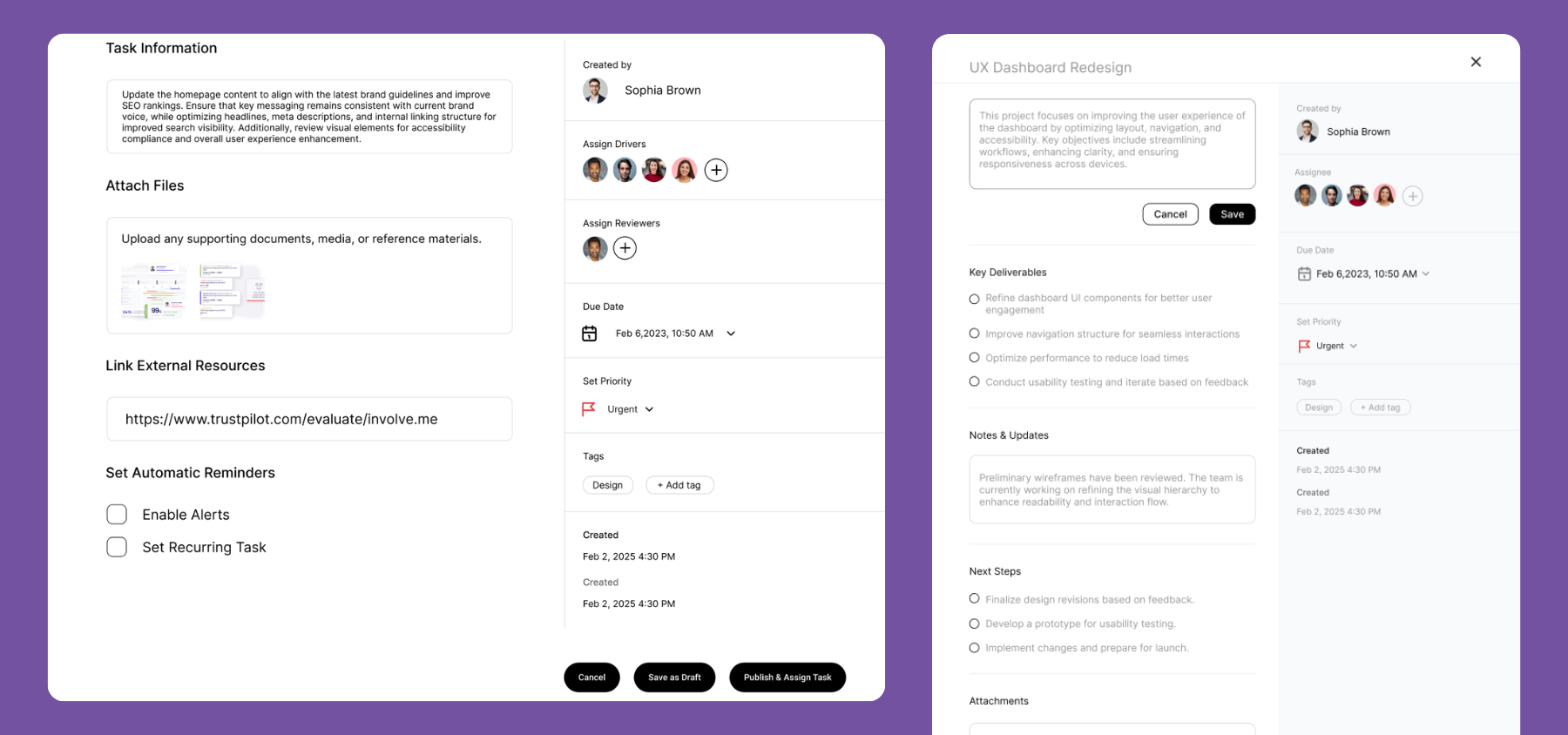
Detailed task management, closing the loop between a negative review and the operational action required to fix it.
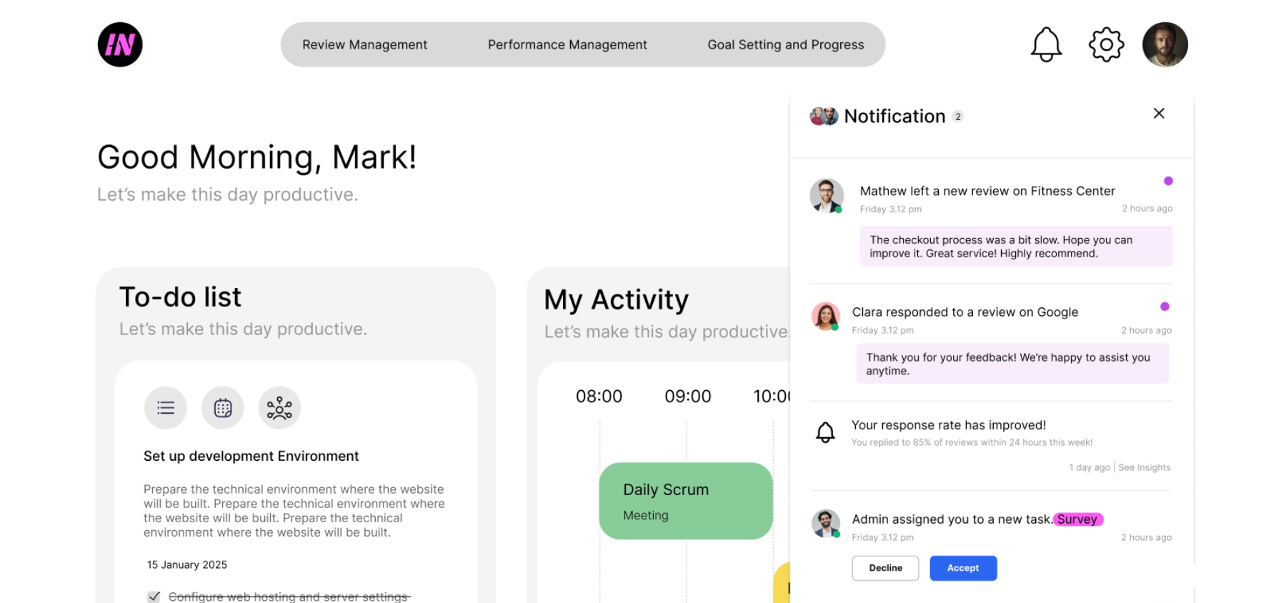
The scoped-down member experience: assigned reviews, personal metrics, and progress toward the team goal.
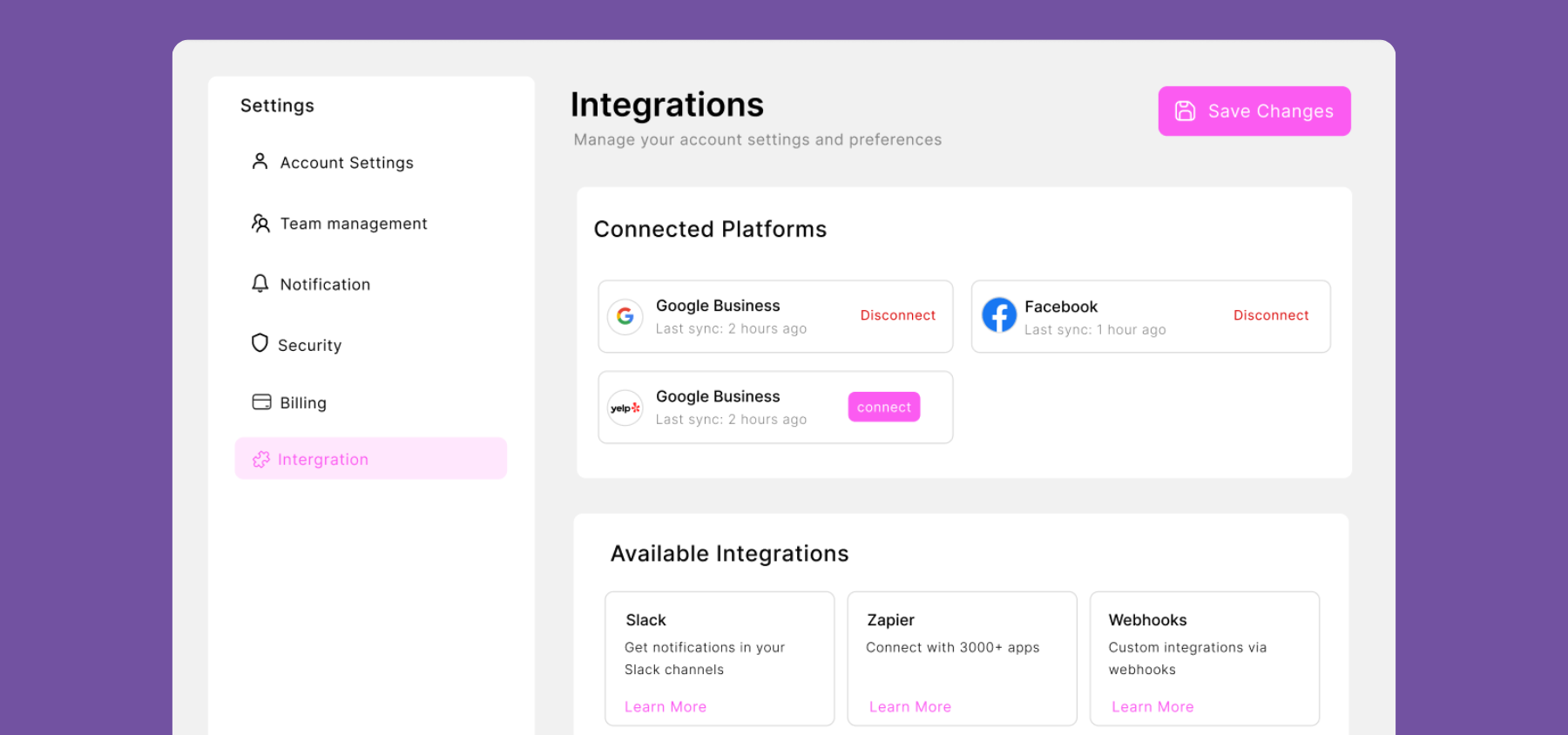
Managing ecosystem connections seamlessly from within the platform settings.
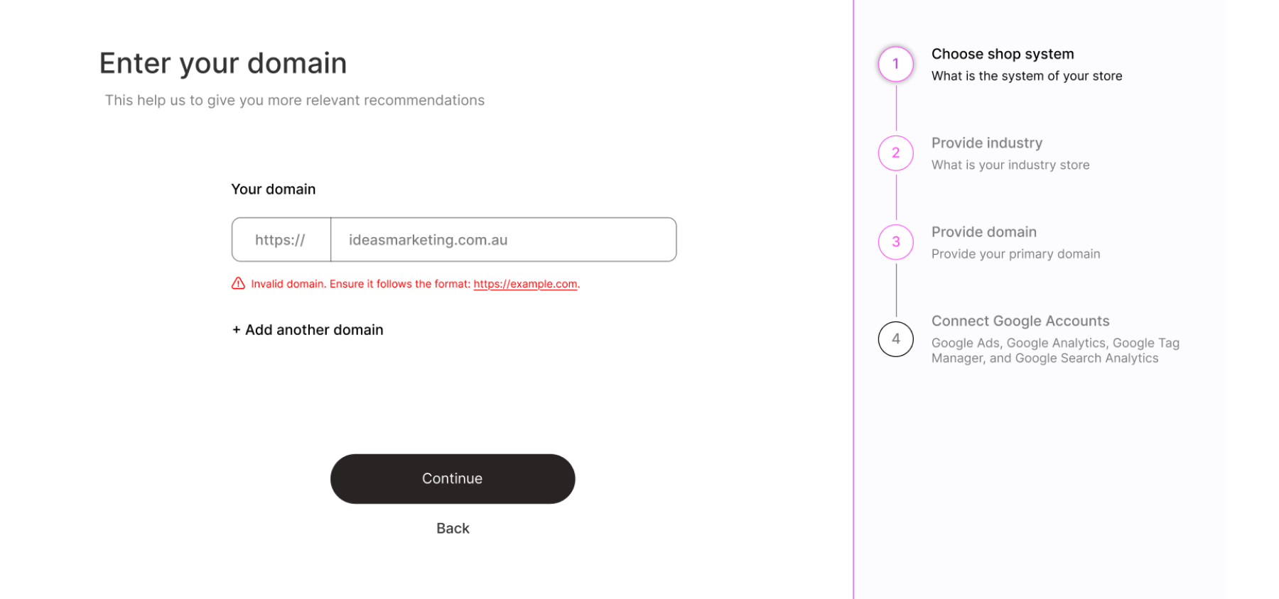
Further supporting screens, ensuring the onboarding wizard holds the user's hand through the setup process.